Email Campaign
* {font-family: Arial, Helvetica, sans-serif !important;}
<!--
.ReadMsgBody { width: 100%; background-color: #ffffff;}
.ExternalClass {width: 100%; background-color: #ffffff;}
.ExternalClass, .ExternalClass p, .ExternalClass span,
.ExternalClass font, .ExternalClass td, .ExternalClass tbody {line-height:100%;}
#outlook a { padding:0;}
html,body {margin: 0 auto !important; padding: 0 !important; height: 100% !important; width: 100% !important;}
* {-ms-text-size-adjust: 100%; -webkit-text-size-adjust: 100%;}
table,td {mso-table-lspace: 0pt !important; mso-table-rspace: 0pt !important;}
table {border-spacing: 0 !important;}
table table table {table-layout: auto;}
a,span a{text-decoration: none !important;}
.yshortcuts, .yshortcuts a, .yshortcuts a:link,.yshortcuts a:visited,
.yshortcuts a:hover, .yshortcuts a span { text-decoration: none !important; border-bottom: none !important;}
/*mailChimp class*/
ul{padding-left:10px; margin:0;}
.default-edit-image{height:20px;}
.tpl-repeatblock {padding: 0px !important; border: 1px dotted rgba(0,0,0,0.2);}
.tpl-content {padding:0px !important;}
/* Start Old CSS */
@media only screen and (max-width: 640px){
.container{width:95%!important; max-width:95%!important; min-width:95%!important;
padding-left:15px!important; padding-right:15px!important; text-align: center!important; clear: both;}
.full-width{width:100%!important; max-width:100%!important; min-width:100%!important; clear: both;}
.full-width-center {width: 100%!important; max-width:100%!important; text-align: center!important; clear: both; margin:0 auto; float:none;}
.force-240-center{width:240px !important; clear: both; margin:0 auto; float:none;}
.auto-center {width: auto!important; max-width:100%!important; text-align: center!important; clear: both; margin:0 auto; float:none;}
.auto-center-all{width: auto!important; max-width:75%!important; text-align: center!important; clear: both; margin:0 auto; float:none;}
.auto-center-all * {width: auto!important; max-width:100%!important; text-align: center!important; clear: both; margin:0 auto; float:none;}
.col-3,.col-3-not-full{width:30.35%!important; max-width:100%!important;}
.col-2{width:47.3%!important; max-width:100%!important;}
.full-block{display:block !important; clear: both;}
/* image */
.image-full-width img{width:100% !important; height:auto !important; max-width:100% !important;}
/* helper */
.space-w-20{width:3.57%!important; max-width:20px!important; min-width:3.5% !important;}
.space-w-20 td:first-child{width:3.5%!important; max-width:20px!important; min-width:3.5% !important;}
.space-w-25{width:4.45%!important; max-width:25px!important; min-width:4.45% !important;}
.space-w-25 td:first-child{width:4.45%!important; max-width:25px!important; min-width:4.45% !important;}
.space-w-30 td:first-child{width:5.35%!important; max-width:30px!important; min-width:5.35% !important;}
.fix-w-20{width:20px!important; max-width:20px!important; min-width:20px!important;}
.fix-w-20 td:first-child{width:20px!important; max-width:20px!important; min-width:20px !important;}
.h-10{display:block !important; height:10px !important;}
.h-20{display:block !important; height:20px !important;}
.h-30{display:block !important; height:30px !important;}
.h-40{display:block !important; height:40px !important;}
.remove-640{display:none !important;}
.text-left{text-align:left !important;}
.clear-pad{padding:0 !important;}
}
@media only screen and (max-width: 479px){
.container{width:95%!important; max-width:95%!important; min-width:124px!important;
padding-left:15px!important; padding-right:15px!important; text-align: center!important; clear: both;}
.full-width,.full-width-479{width:100%!important; max-width:100%!important; min-width:124px!important; clear: both;}
.full-width-center {width: 100%!important; max-width:100%!important; min-width:124px!important; text-align: center!important; clear: both; margin:0 auto; float:none;}
.auto-center-all{width: 100%!important; max-width:100%!important; text-align: center!important; clear: both; margin:0 auto; float:none;}
.auto-center-all * {width: auto!important; max-width:100%!important; text-align: center!important; clear: both; margin:0 auto; float:none;}
.col-3{width:100%!important; max-width:100%!important; text-align: center!important; clear: both;}
.col-3-not-full{width:30.35%!important; max-width:100%!important; }
.col-2{width:100%!important; max-width:100%!important; text-align: center!important; clear: both;}
.full-block-479{display:block !important; clear: both; padding-top:10px; padding-bottom:10px; }
/* image */
.image-full-width img{width:100% !important; height:auto !important; max-width:100% !important; min-width:124px !important;}
.image-min-80 img{width:100% !important; height:auto !important; max-width:100% !important; min-width:80px !important;}
.image-min-100 img{width:100% !important; height:auto !important; max-width:100% !important; min-width:100px !important;}
/* halper */
.space-w-20{width:100%!important; max-width:100%!important; min-width:100% !important;}
.space-w-20 td:first-child{width:100%!important; max-width:100%!important; min-width:100% !important;}
.space-w-25{width:100%!important; max-width:100%!important; min-width:100% !important;}
.space-w-25 td:first-child{width:100%!important; max-width:100%!important; min-width:100% !important;}
.space-w-30{width:100%!important; max-width:100%!important; min-width:100% !important;}
.space-w-30 td:first-child{width:100%!important; max-width:100%!important; min-width:100% !important;}
.remove-479{display:none !important;}
img{max-width:280px !important;}
.resize-font, .resize-font *{font-size: 37px !important; line-height: 48px !important;}
}
/* End Old CSS */
@media only screen and (max-width:640px){
.full-width,.container{width:95%!important; float:none!important; min-width:95%!important; max-width:95%!important; margin:0 auto!important; padding-left:15px; padding-right:15px; text-align: center!important; clear: both;}
#mainStructure, #mainStructure .full-width .full-width,table .full-width .full-width, .container .full-width{width:100%!important; float:none!important; min-width:100%!important; max-width:100%!important; margin:0 auto!important; clear: both; padding-left:0; padding-right:0;}
.no-pad{padding:0!important;}
.full-block{display:block!important;}
.image-full-width,
.image-full-width img{width:100%!important; height:auto!important; max-width:100%!important; min-width: 100px !important;}
.full-width.fix-800{min-width:auto!important;}
.remove-block{display:none !important; padding-top:0px; padding-bottom:0px;}
.pad-lr-20{padding-left:20px!important; padding-right:20px!important;}
.row{display:table-row!important;}
}
@media only screen and (max-width:480px){
.full-width,.container{width:95%!important; float:none!important; min-width:95%!important; max-width:95%!important; margin:0 auto!important; padding-left:15px; padding-right:15px; text-align: center!important; clear: both;}
#mainStructure, #mainStructure .full-width .full-width,table .full-width .full-width,.container .full-width{width:100%!important; float:none!important; min-width:100%!important; max-width:100%!important; margin:0 auto!important; clear: both; padding-left:0; padding-right:0;}
.no-pad{padding:0!important;}
.full-block{display:block!important;}
.image-full-width,
.image-full-width img{width:100%!important; height:auto!important; max-width:100%!important; min-width: 100px !important;}
.full-width.fix-800{min-width:auto!important;}
.remove-block{display:none !important; padding-top:0px; padding-bottom:0px;}
.pad-lr-20{padding-left:20px!important; padding-right:20px!important;}
.row{display:table-row!important;}
}
td ul{list-style: initial; margin:0; padding-left:20px;}
body{background-color:#ffffff; margin: 0 auto !important; height:auto!important;} #preview-template #mainStructure{padding:20px 0px 60px 0px!important;} .default-edit-image{height:20px;} tr.tpl-repeatblock , tr.tpl-repeatblock > td{ display:block !important;} .tpl-repeatblock {padding: 0px !important;border: 1px dotted rgba(0,0,0,0.2); }
@media only screen and (max-width: 640px){ .full-block{display:table !important; padding-top:0px; padding-bottom:0px;} .row{display:table-row!important;} .image-100-percent img{ width:100%!important; height: auto !important; max-width: 100% !important; min-width: 124px !important;}}
@media only screen and (max-width: 480px){ .full-block{display:table !important; padding-top:0px; padding-bottom:0px;} .row{display:table-row!important;}}
*[x-apple-data-detectors], .unstyle-auto-detected-links *,
.aBn{border-bottom: 0 !important; cursor: default !important;color: inherit !important; text-decoration: none !important;font-size: inherit !important; font-family: inherit !important; font-weight: inherit !important;line-height: inherit !important;}
.im {color: inherit !important;}
.a6S {display: none !important; opacity: 0.01 !important;}
img.g-img + div {display: none !important;}
img {height: auto !important; line-height: 100%; outline: none; text-decoration: none !important; -ms-interpolation-mode:bicubic;}
a img{ border: 0 !important;}
a:active,a:link,a:visited{color:inherit; text-decoration: none !important; }
#outlook a, span a ,a {color:inherit; text-decoration: none !important;}
u + #body a {color: inherit; text-decoration: none !important; font-size: inherit; font-family: inherit; font-weight: inherit; line-height: inherit;}
.tpl-content{padding:0 !important;}
table td {border-collapse:unset; -webkit-hyphens: none; -moz-hyphens: none; hyphens: none;}
table p{margin:0; padding:0;}
#mainStructure table,#mainStructure img{min-width:0!important;}
#mainStructure{padding:0 !important;}
.row th{display:table-cell;}
.row{display:flex;}
body { font-size: 0; line-height: 0; }
table,tr { font-size:1px; mso-line-height-alt:0; line-height:0; mso-margin-top-alt:1px;}
body,table,td,span,a,font{font-family: Arial, Helvetica, sans-serif!important; mso-line-height-rule:exactly; -ms-text-size-adjust:100%; -webkit-text-size-adjust:100%;}
a img{ border: 0 !important;}
a:active,a:link,a:visited{color:inherit; text-decoration: none !important; }
#outlook a,span a ,a {color:inherit; text-decoration: none !important;}
table td ,table th{display:table-cell!important;}
table,img{min-width:0!important;}
96
|
|
|
|
|
|
|
|
| |
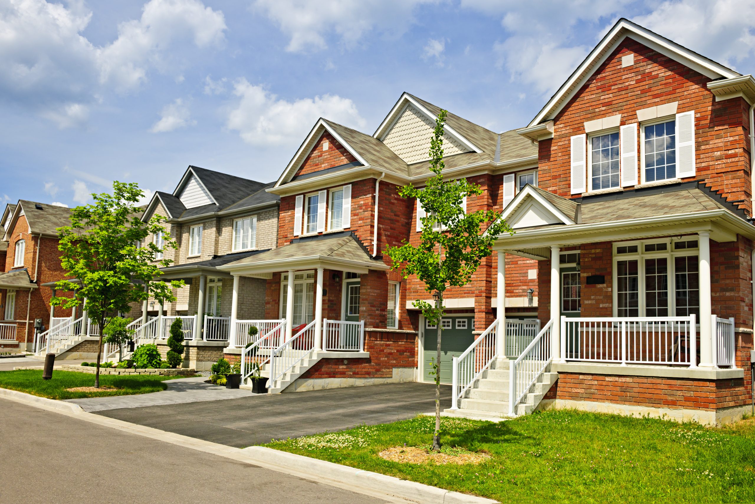
Pro Investors!
Refinance your Residential investment homes
into our Portfolio Loans!
(2+) properties in 1 loan
(Simple, Easily Managed, Low rates, consolidated LTV and each
property is easily transferred out of portfolio when needed.) |
| |
|
|
|
|
| |
|
|
| |
|
|
|
|
|
|
- Rates as low as 3.75%
- 30 year Fixed
- Up to 80% LTV Purchase / 75% Cash Out
- 620+ Fico
- Leased, Unleased or Airbnb
- No Tax Returns required
- Foreign National OK
- Individual, LLC or Corporation
|
| |
|
|
|
|
|
|
|
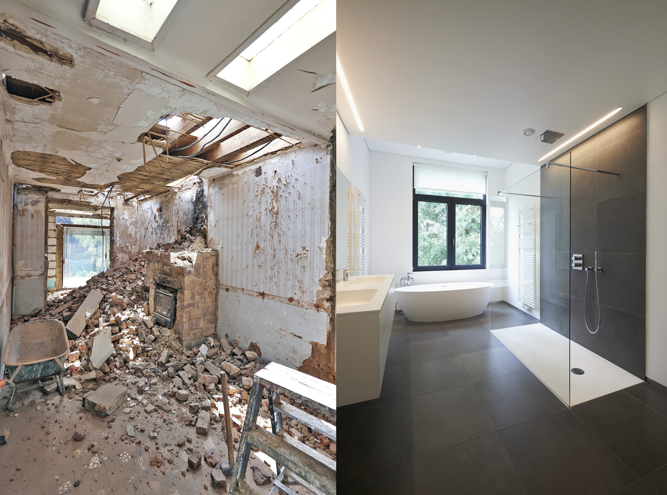
| 1 - 4 Unit Bridge / Rehab |
| |
|
- Rates as low as 6.375%
- Loan amounts up to $25,000,000
- 6 - 24 months interest only
- Up to 90% LTV / 100% Rehab budget Purchase
- Up to 80% LTV / 100% Rehab budget Refinance
- 620+ Fico / No Fico OK
- No Tax Returns required
- Foreign National OK
- Individual, LLC or Corporation
|
| |
|
|
|
|
| |
|
|
|
|
|
|
|
| |
|
|
|
| |
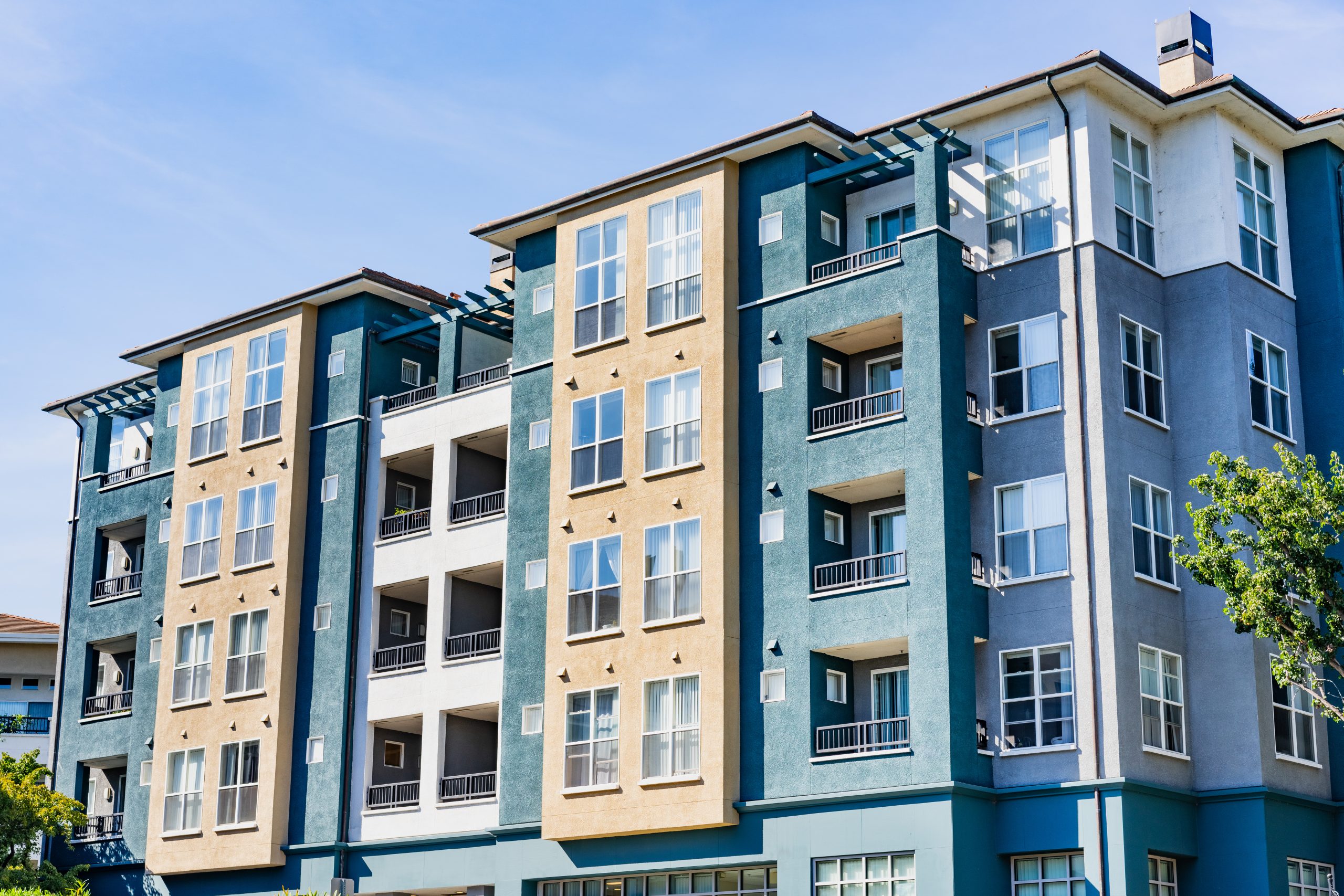
Multifamily 5+ Unit
Rentals |
| |
|
|
|
|
|
|
|
- Rates as low as 2.59%
- 30 fixed term / 5, 7, 10 terms amortized over 30 years available
- Up to 75% LTV Purchase / 70% Refinance or Cashout
- 650 + Fico
- Minimum occupancy 85%
- Individual, LLC or Corporation
- Minimum Debt Service Coverage Ratio 1.00%
|
| |
|
| |
|
|
|
| |
|
|
|
| |
|
|
| |
|
|
|
| |
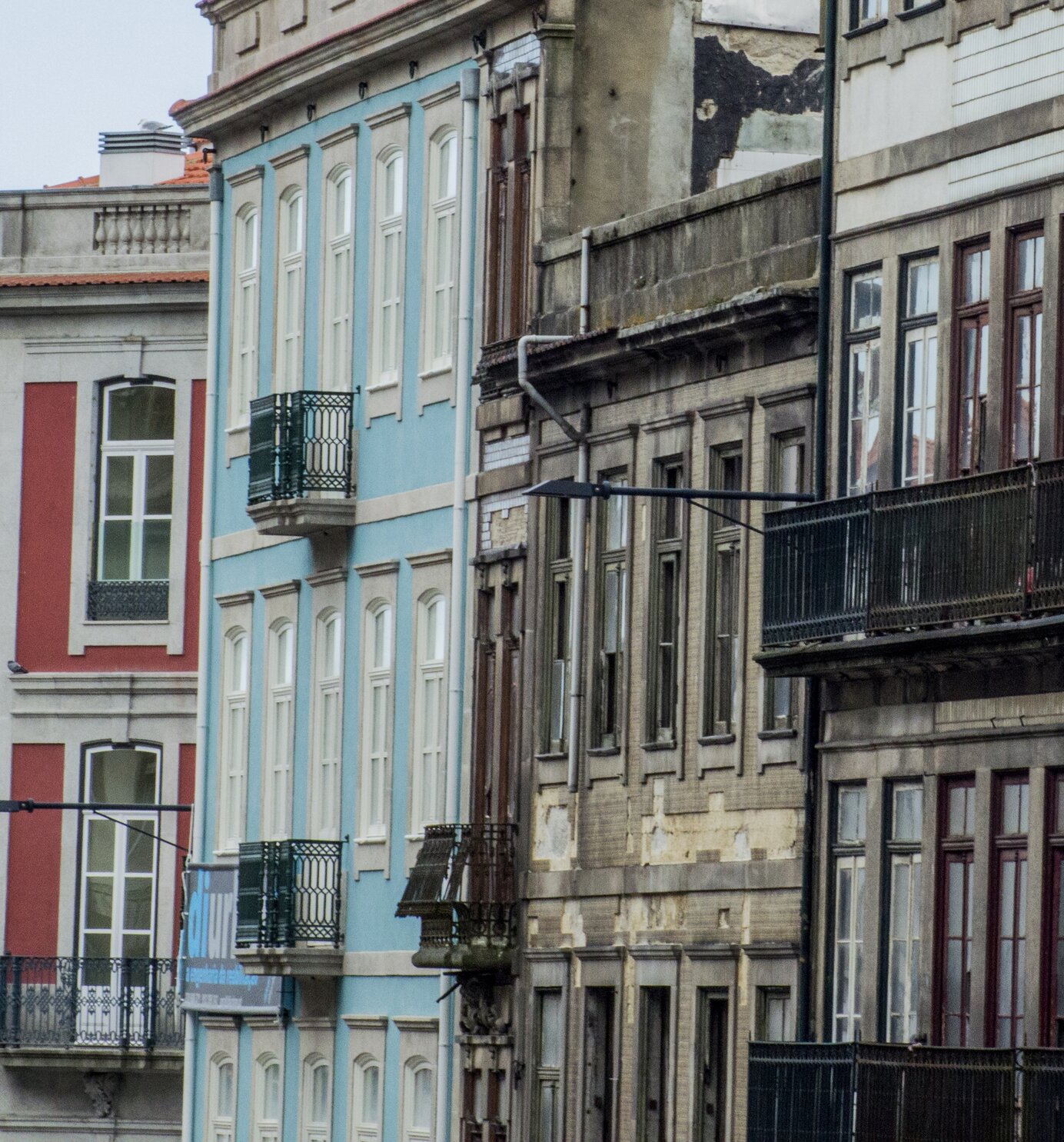
Multifamily 5+ Unit
Bridge / Rehab
|
| |
|
- Rates as low as 7.00%
- Loan amounts $500,000+
- 6 - 24 months interest only
- Up to 90% LTV / 100% Rehab budget Purchase
- Up to 80% LTV / 100% Rehab budget Refinance
- 620+ Fico / No Fico OK
- No Tax Returns required
- Foreign National OK
- Individual, LLC or Corporation
|
| |
|
|
|
| |
|
|
|
| |
|
|
|
|
| |
What's your Strategy?
|
| |
Every one of our Successful Investors has a Strategy.
Find yours and "DUPLICATE" it with us!
|
| |
|
- Buy and Rent ?
- Fix and Flip ?
|
| |
|
|
|
|
|
- Buy, Rehab, Rent and Refi ?
- Construction ?
|
| |
|
|
|
|
| |
|
|
|
|
|
|
|
|
|